Matplotlib

bokeh


| Matplotlib | bokeh | |
|---|---|---|
| 1 | 24 | |
| 1 | 18,920 | |
| - | 1.0% | |
| 6.4 | 9.5 | |
| 5 months ago | 1 day ago | |
| Jupyter Notebook | Python | |
| - | BSD 3-clause "New" or "Revised" License |
Stars - the number of stars that a project has on GitHub. Growth - month over month growth in stars.
Activity is a relative number indicating how actively a project is being developed. Recent commits have higher weight than older ones.
For example, an activity of 9.0 indicates that a project is amongst the top 10% of the most actively developed projects that we are tracking.
Matplotlib
-
Mastering Matplotlib: A Step-by-Step Tutorial for Beginners
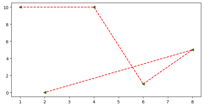 ## Scatter Graph * It similar to a line graph * Used to show how one variable is related to another * It consists of data points, if it is linear then it is highly correlated * It only marks the data point. * Syntax: plt.scatter(x,y) ### Parameter of Scatter Graph * c: Sets color of markers. * s: Sets the size of markers. * marker: Select a marker. e.g.: circle, triangle, etc * edgecolor: Sets the color of lines on the edges of markers. ```python x=[1,4,6,8,2] y=[10,10,1,5,0] fig = plt.figure(figsize=(8,4)) ax = fig.add_subplot() ax.scatter(x , y , c='red' , s=500 , marker='*' , edgecolor='blue' , label='scatter') ax.set_title('Scatter') ax.set_xlabel('X-Axis') ax.set_ylabel('Y-Axis') plt.legend()
bokeh
-
Mastering Matplotlib: A Step-by-Step Tutorial for Beginners
Bokeh - Interactive Web Plotting for Python.
-
Top 10 growing data visualization libraries in Python in 2023
Github: https://github.com/bokeh/bokeh
- Bokeh Python Library for Interactive Visualizations
-
Best data visualisation library
If you don’t mind passing html around this library allows you to share full interactive plot:
-
Emerging Rust GUI libraries in a WASM world
It sounds like you want BokehJS. It was one of the alternatives I was recommended while I was exploring, but for various reasons my particular use case is not so easy to integrate (plus my backend was already in Rust).
https://github.com/bokeh/bokeh
I did do a basic test, and the raw rects-on-screen performance is roughly comparable to my final solution.
-
What Python modules can I use to create my own indicators? Like the indicator below, I very new to Python so please don’t be rude
I just came across this: https://bokeh.org/
-
Interactive plots
Take a look at Bokeh. https://bokeh.org/
- December goals
-
[OC] The Criminal Podcast's intros have gotten longer over time
I recorded all 200 "I'm Phoebe Judge, this is Criminal" intros from the Criminal podcast, measured the length, and plotted using python's Bokeh package.
- What's the most scalable visualization library?
What are some alternatives?
plotly - The interactive graphing library for Python :sparkles: This project now includes Plotly Express!
seaborn - Statistical data visualization in Python
Altair - Declarative statistical visualization library for Python
matplotlib - matplotlib: plotting with Python
PyQtGraph - Fast data visualization and GUI tools for scientific / engineering applications
folium - Python Data. Leaflet.js Maps.
Apache Superset - Apache Superset is a Data Visualization and Data Exploration Platform [Moved to: https://github.com/apache/superset]
pygal - PYthon svg GrAph plotting Library
bqplot - Plotting library for IPython/Jupyter notebooks
Graphviz - Simple Python interface for Graphviz
Cartopy - Cartopy - a cartographic python library with matplotlib support
Redash - Make Your Company Data Driven. Connect to any data source, easily visualize, dashboard and share your data.