Jupyter Notebook scatterplot Projects
-
InfluxDB
Power Real-Time Data Analytics at Scale. Get real-time insights from all types of time series data with InfluxDB. Ingest, query, and analyze billions of data points in real-time with unbounded cardinality.

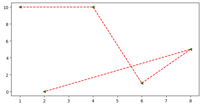 ## Scatter Graph * It similar to a line graph * Used to show how one variable is related to another * It consists of data points, if it is linear then it is highly correlated * It only marks the data point. * Syntax: plt.scatter(x,y) ### Parameter of Scatter Graph * c: Sets color of markers. * s: Sets the size of markers. * marker: Select a marker. e.g.: circle, triangle, etc * edgecolor: Sets the color of lines on the edges of markers. ```python x=[1,4,6,8,2] y=[10,10,1,5,0] fig = plt.figure(figsize=(8,4)) ax = fig.add_subplot() ax.scatter(x , y , c='red' , s=500 , marker='*' , edgecolor='blue' , label='scatter') ax.set_title('Scatter') ax.set_xlabel('X-Axis') ax.set_ylabel('Y-Axis') plt.legend()
Index
| Project | Stars | |
|---|---|---|
| 1 | Matplotlib | 1 |

Sponsored