Matplotlib

VisPy


| Matplotlib | VisPy | |
|---|---|---|
| 1 | 4 | |
| 1 | 3,228 | |
| - | 0.9% | |
| 6.4 | 8.6 | |
| 5 months ago | 3 days ago | |
| Jupyter Notebook | Python | |
| - | GNU General Public License v3.0 or later |
Stars - the number of stars that a project has on GitHub. Growth - month over month growth in stars.
Activity is a relative number indicating how actively a project is being developed. Recent commits have higher weight than older ones.
For example, an activity of 9.0 indicates that a project is amongst the top 10% of the most actively developed projects that we are tracking.
Matplotlib
-
Mastering Matplotlib: A Step-by-Step Tutorial for Beginners
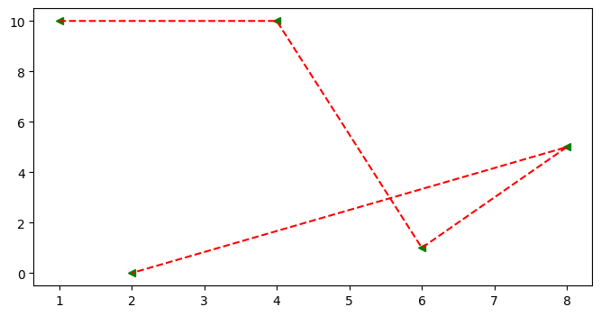 ## Scatter Graph * It similar to a line graph * Used to show how one variable is related to another * It consists of data points, if it is linear then it is highly correlated * It only marks the data point. * Syntax: plt.scatter(x,y) ### Parameter of Scatter Graph * c: Sets color of markers. * s: Sets the size of markers. * marker: Select a marker. e.g.: circle, triangle, etc * edgecolor: Sets the color of lines on the edges of markers. ```python x=[1,4,6,8,2] y=[10,10,1,5,0] fig = plt.figure(figsize=(8,4)) ax = fig.add_subplot() ax.scatter(x , y , c='red' , s=500 , marker='*' , edgecolor='blue' , label='scatter') ax.set_title('Scatter') ax.set_xlabel('X-Axis') ax.set_ylabel('Y-Axis') plt.legend()
VisPy
-
Mastering Matplotlib: A Step-by-Step Tutorial for Beginners
VisPy - High-performance scientific visualization based on OpenGL.
-
Top 10 growing data visualization libraries in Python in 2023
Github: https://github.com/vispy/vispy
-
Seeking library recommendation for 3D visualization of crystal structure
Two similar alternatives you could look at are PyVista which is based on the same framework as Mayavi and VisPy. Mayavi is strongly dependent on the whole Enthought suite which can be a disadvantage if you don’t really use its abilities.
-
Show HN: MPL Plotter – Python library to make technical plots more efficiently
2. I recommend Datashader (https://datashader.org/) (HoloViz is super cool) and Vispy (https://vispy.org/). I found Vispy's documentation a bit lacking some time ago, but they probably have improved it since then, and it's very capable. Lastly, check Taichi (https://taichi.graphics/), might not be a conventional data representation library (or rather, not only), but it's amazing and worth a look.
To add some more depth to the Seaborn comparison, and not being an expert Seaborn user, I'd say:
1. MPL Plotter is lighter (but also with less wide-ranging plot options)
What are some alternatives?
PyQtGraph - Fast data visualization and GUI tools for scientific / engineering applications
matplotlib - matplotlib: plotting with Python
plotly - The interactive graphing library for Python :sparkles: This project now includes Plotly Express!
pyrender - Easy-to-use glTF 2.0-compliant OpenGL renderer for visualization of 3D scenes.
bokeh - Interactive Data Visualization in the browser, from Python
Flask JSONDash - :snake: :bar_chart: :chart_with_upwards_trend: Build complex dashboards without any front-end code. Use your own endpoints. JSON config only. Ready to go.
SnakeViz - An in-browser Python profile viewer
pygraphviz - Python interface to Graphviz graph drawing package
Altair - Declarative statistical visualization library for Python
seaborn - Statistical data visualization in Python
GR - GR framework: a graphics library for visualisation applications
Apache Superset - Apache Superset is a Data Visualization and Data Exploration Platform [Moved to: https://github.com/apache/superset]