Matplotlib
plotnine


| Matplotlib | plotnine | |
|---|---|---|
| 1 | 36 | |
| 1 | 3,835 | |
| - | - | |
| 6.4 | 9.6 | |
| 5 months ago | 10 days ago | |
| Jupyter Notebook | Python | |
| - | MIT License |
Stars - the number of stars that a project has on GitHub. Growth - month over month growth in stars.
Activity is a relative number indicating how actively a project is being developed. Recent commits have higher weight than older ones.
For example, an activity of 9.0 indicates that a project is amongst the top 10% of the most actively developed projects that we are tracking.
Matplotlib
-
Mastering Matplotlib: A Step-by-Step Tutorial for Beginners
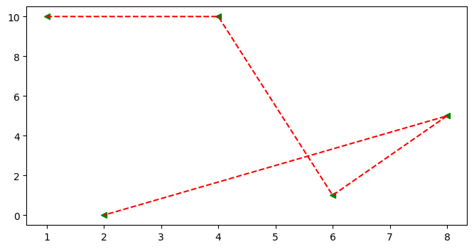 ## Scatter Graph * It similar to a line graph * Used to show how one variable is related to another * It consists of data points, if it is linear then it is highly correlated * It only marks the data point. * Syntax: plt.scatter(x,y) ### Parameter of Scatter Graph * c: Sets color of markers. * s: Sets the size of markers. * marker: Select a marker. e.g.: circle, triangle, etc * edgecolor: Sets the color of lines on the edges of markers. ```python x=[1,4,6,8,2] y=[10,10,1,5,0] fig = plt.figure(figsize=(8,4)) ax = fig.add_subplot() ax.scatter(x , y , c='red' , s=500 , marker='*' , edgecolor='blue' , label='scatter') ax.set_title('Scatter') ax.set_xlabel('X-Axis') ax.set_ylabel('Y-Axis') plt.legend()
plotnine
- FLaNK AI Weekly 18 March 2024
-
A look at the Mojo language for bioinformatics
To your last point, have you tried plotnine? It's meant to be ggplot2 for python.
https://github.com/has2k1/plotnine
-
Mastering Matplotlib: A Step-by-Step Tutorial for Beginners
plotnine - A grammar of graphics for Python based on ggplot2.
-
Top 10 growing data visualization libraries in Python in 2023
Github: https://github.com/has2k1/plotnine
-
Lets-Plot: An open-source plotting library by JetBrains
This seems quite similar to plotnine [0], which also provides a grammar of graphics interface for Python. That said, I love ggplot and I can't wait to use this in my research! I hope we can port/re-implement ggthemes, scientificplots [1], and other ggplot libraries for lets-plot.
0: https://plotnine.readthedocs.io/en/stable/
1: https://github.com/garrettj403/SciencePlots
- When would you use R instead of Python?
-
[P] Easily make complex plots using ChatGPT [open source]
There is [plotnine](https://plotnine.readthedocs.io/en/stable/) which tries to implement ggplot in Python.
-
Is R or Python an EASIER option for non-CS/SE grads?
You could use plotnine if you like the grammar of graphics concept: https://plotnine.readthedocs.io/en/stable/
-
Every modeler is supposed to be a great Python programmer
> Python doesn’t yet have anything remotely close to ggplot for rapidly making exploratory graphics, for example.
Plug for plotnine (https://plotnine.readthedocs.io/en/stable/). I don't know R but use ggplot indirectly through this library for exploratory data analysis, and comparing the experience to any other python plotting library, I understand why R folks are usually so sad to be using Python.
-
Why has nobody ported ggplot to Python?
They have, https://plotnine.readthedocs.io/en/stable/
What are some alternatives?
seaborn - Statistical data visualization in Python
matplotlib - matplotlib: plotting with Python
Altair - Declarative statistical visualization library for Python
plotly - The interactive graphing library for Python :sparkles: This project now includes Plotly Express!
ggplot - ggplot port for python
bokeh - Interactive Data Visualization in the browser, from Python
polars - Dataframes powered by a multithreaded, vectorized query engine, written in Rust
DearPyGui - Dear PyGui: A fast and powerful Graphical User Interface Toolkit for Python with minimal dependencies
PyQtGraph - Fast data visualization and GUI tools for scientific / engineering applications
pydot - Python interface to Graphviz's Dot language
Flask JSONDash - :snake: :bar_chart: :chart_with_upwards_trend: Build complex dashboards without any front-end code. Use your own endpoints. JSON config only. Ready to go.
Apache Superset - Apache Superset is a Data Visualization and Data Exploration Platform [Moved to: https://github.com/apache/superset]